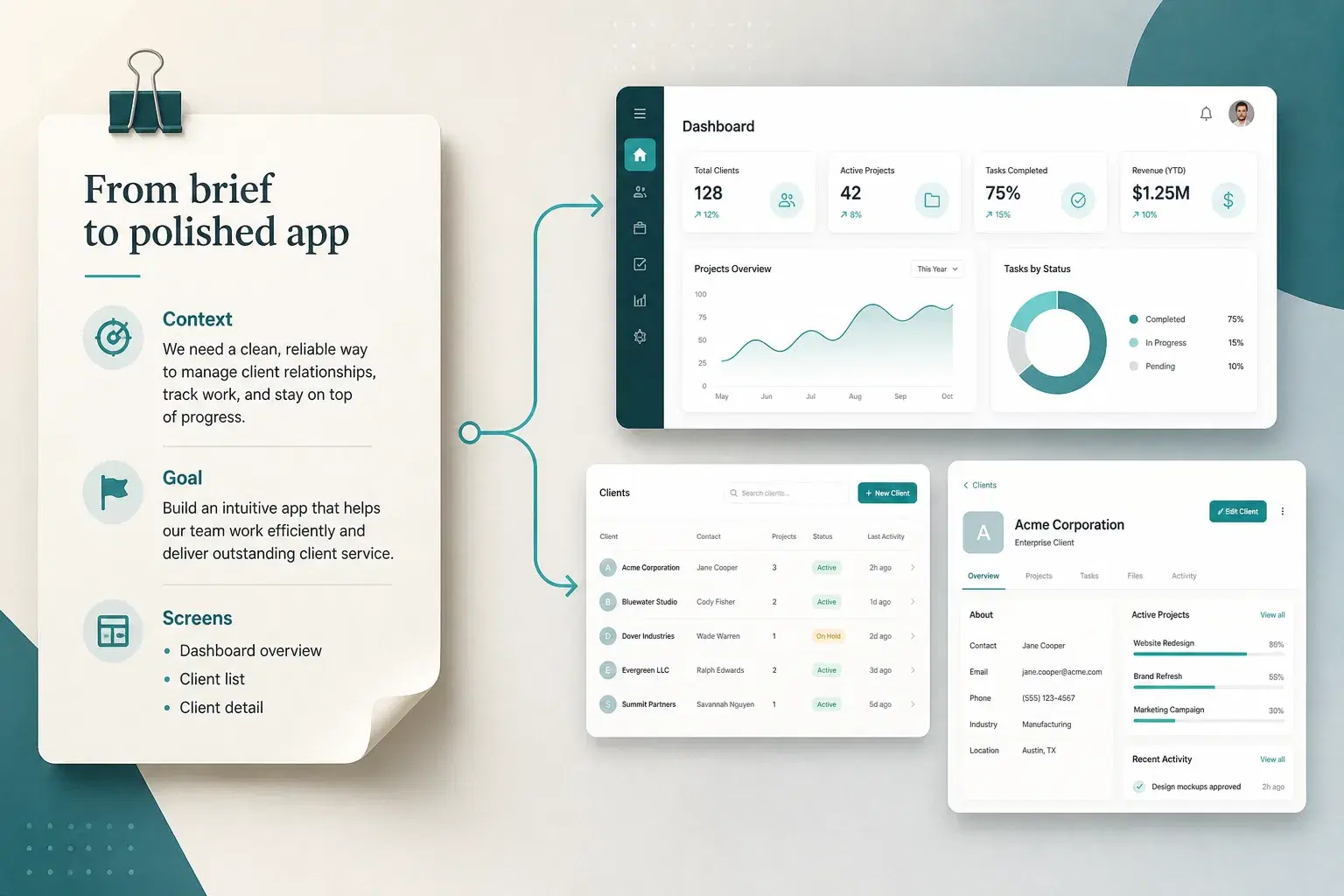
Building an app with AI removed the need to write code line by line, but not the need to think clearly. The bottleneck moved: instead of typing syntax, you write a brief. A vague prompt produces a vague app (generic screens, invented features, missing edge cases). A precise one gets remarkably close on the first try. This guide shows how to write prompts to build an app: a reusable anatomy, bad vs good examples, and an iteration rhythm that does not break what already works.
The same principles show up in official model guidance. OpenAI's prompt engineering guide stresses clear instructions and iterative testing. For AI app builders, that means describing outcomes users can see, not React patterns the model should invent for you.
The 7-part anatomy of a good app prompt
Treat your first prompt like a brief for a freelance developer who has never met you and cannot ask clarifying questions before starting. The more of the following it answers on its own, the less the AI has to guess, and the less you will correct later.
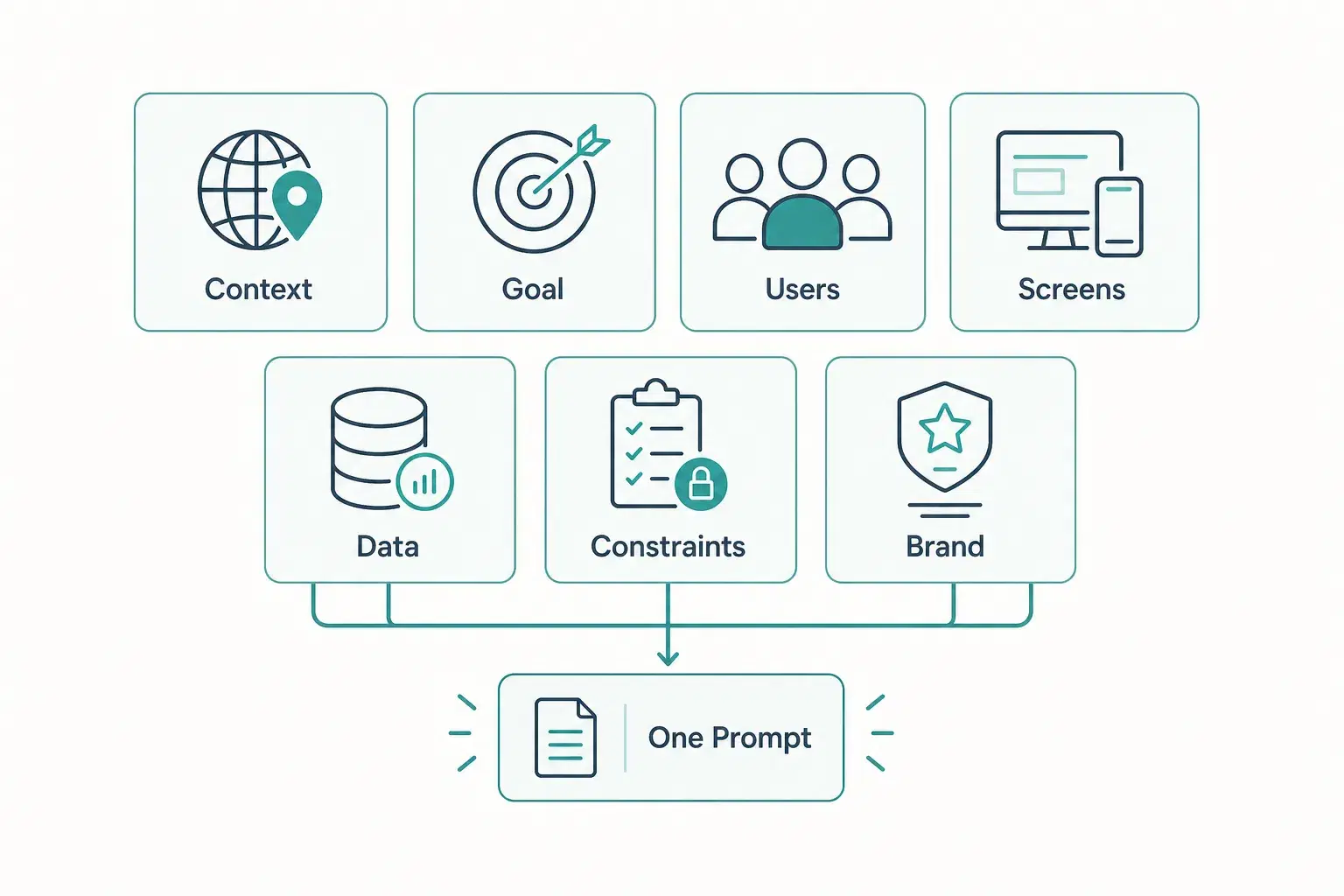
- Context, who and what: who the app is for and what problem it solves, in one or two sentences.
- Goal: the one main job someone must complete, sell a service, track projects, manage a waitlist.
- Users: solo user, small internal team, external clients, or several roles with different access.
- Key screens: the four to six pages that matter most, named explicitly, dashboard, client list, invoice detail, settings.
- Data entities: the nouns of your app and how they relate, a client has many projects; a project has many invoices.
- Constraints: non-negotiables, login required, payments, mobile-first, a specific integration.
- Tone and brand: colors, style references, formal vs playful, “minimal like Stripe” beats “make it modern.”
Bad prompt vs good prompt
The gap between a mediocre app and a useful one is rarely the model. It is almost always the prompt. Here is the same idea, written twice.
Bad
"Build me an app to manage my clients."
Good
"I run a small design agency with two other freelancers. Build a client portal where we see clients, projects per client, and invoices per project. I need a dashboard of active projects, a client list with contacts, and a project page with tasks and invoice status (draft, sent, paid). Clients log in and see only their own data. Clean, minimal UI in blue and white."
The bad version forces the AI to invent context, screens, data and access rules. The good version supplies agency context, the goal, entities and relationships (client → project → invoice), named screens, a hard constraint (role-based access), and a visual tone. Almost nothing is left to guess.
Remember
If a colleague with almost no context would not know what to build from your prompt, neither will the model. Anthropic's prompting guidance uses the same test: clarity for a sharp new hire equals clarity for the AI.
For the underlying principle, be explicit, add context, avoid vague adjectives, see Anthropic's Claude prompting best practices.
Start broad, then refine screen by screen
Packing every field and every rule into one giant prompt usually backfires: the model juggles too much and drops half of it. A better rhythm matches how real products get built, skeleton first, then depth. That is also how vibe coding stays productive: intent first, then tight feedback loops.
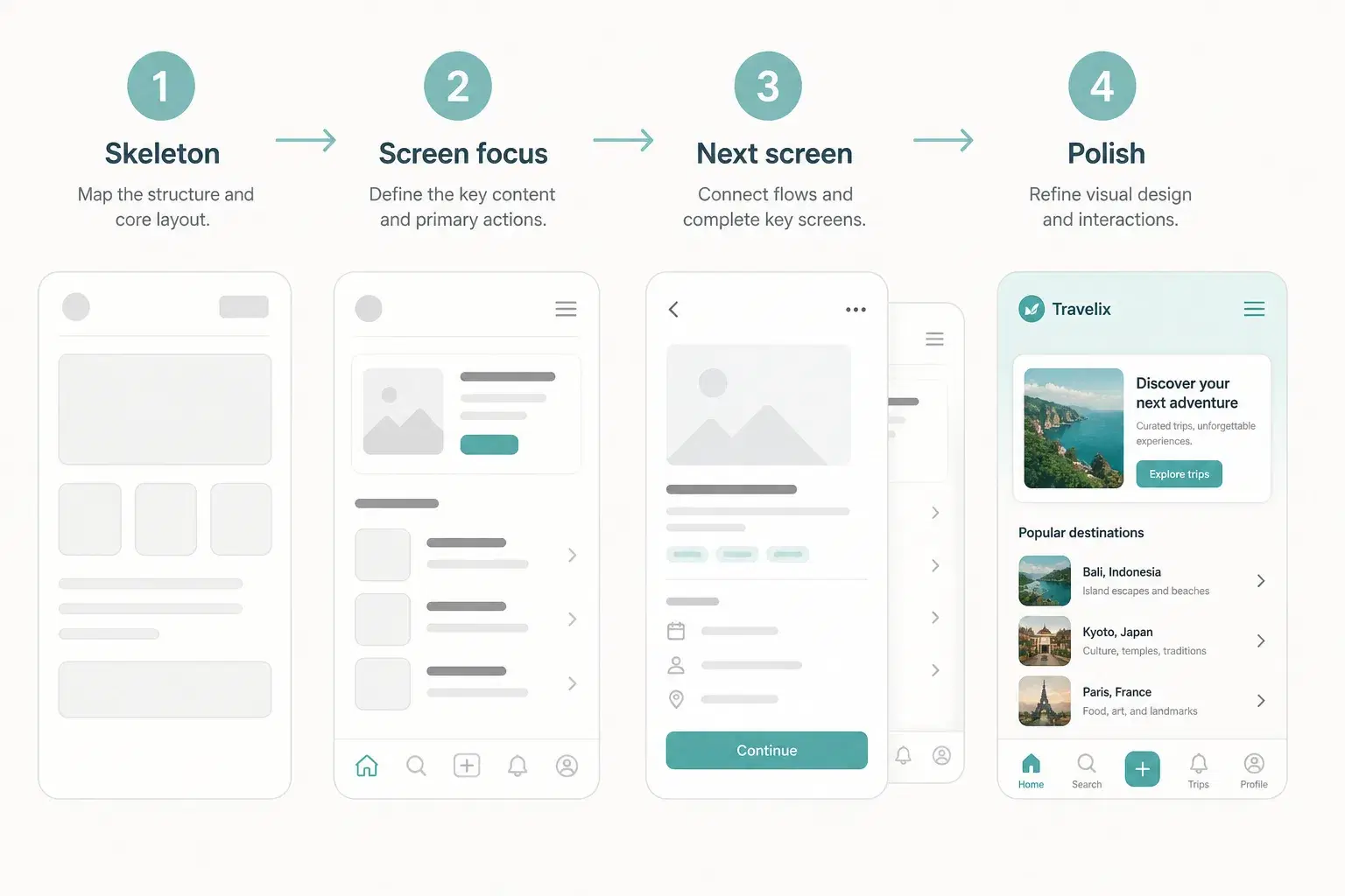
- First prompt: purpose, users, and the handful of screens so the AI can build the overall skeleton.
- Second round: pick one screen, “On the client list, add search and a filter by status.”
- Third round: move to the next screen only when the previous one feels right.
- Polish: copy, spacing, empty states, and edge cases once the structure holds.
App-builder guides such as Knack's AI prompt patterns make the same point: start with a few entities and clear relationships, then expand. Resist the urge to specify the entire product in message one.
Re-prompting vs micro-patches
Not every request deserves the same phrasing. Structural changes need a fuller prompt that re-states context for that part of the app. Tiny tweaks work better as short, surgical messages.
| Situation | Use | Example phrasing |
|---|---|---|
| New entity, new role, or reshaped navigation | Re-prompt | "Add invoices tied to each project. Status: draft, sent, paid. Show them on the project page." |
| Label, color, sort order, single field | Micro-patch | "On the invoice detail page, make the Paid badge green." |
| AI made a mess of a screen | Re-prompt that screen | Restate what the screen must do; say what must stay unchanged elsewhere. |
Even for micro-patches, name the screen and the element. “Make it look better” is not a prompt, it is a hope.
Mistakes that sabotage your prompts
- Being too vague. "Modern and professional" is not actionable. Name a reference, a color, or a layout.
- Asking for too many features at once. Auth + payments + dashboard + notifications in one message forces thin attention across everything.
- Describing implementation instead of outcome. Skip "use a useEffect and a reducer." Say what the user should see and do.
- Forgetting edge cases. Empty lists, failed payments, a client with zero projects, name them early.
Tips that work with any AI app builder
- Name the screen. "On the dashboard…" removes ambiguity about where a change applies.
- Give real examples. Paste real plan names and prices instead of “add a pricing table.”
- Change one thing at a time. One clear intent per message makes it obvious what worked.
- Say what must stay the same. When refining one screen, protect the rest of the app explicitly.
- Test with real-shaped data early. Three sample rows can hide layout breaks that show up at fifty.
Once prompting feels solid, tool choice matters for ownership and iteration safety, start with our best AI app builders comparison.
Same anatomy for sites, web apps, and mobile
The framework does not change by product type, only the emphasis does.
| Product | Emphasize in the prompt |
|---|---|
| Showcase site | Tone, brand, and section copy (hero, services, proof, contact). |
| Web app / MVP | Entities, relationships, roles, and the core job-to-be-done. |
| Mobile app | Navigation patterns, thumb-friendly actions, offline needs, small-screen layout. |
For a mobile-specific path, see how to create a mobile app. For validating a product idea with the same prompt discipline, pair this guide with how to build a startup MVP.
Copy-paste prompt examples
Three complete prompts, one per project type, that follow the seven-block anatomy. Replace the bracketed parts with your own, keep the structure, and send them as they are to your AI app builder. Each one fits in a single paragraph on purpose: the skeleton comes first, the screen-by-screen details come next.
Prompt 1: showcase website
"I am an [osteopath] in [Bristol], solo practice. Create a five-page showcase website: home, services (adult, infant and sports consultations), about, pricing and contact with a form. Audience: working adults looking for a practitioner nearby. Goal: get appointment requests by phone or through the form. Constraints: mobile-first, a visible call button on every page, legal notice and privacy policy. Reassuring, understated tone, white and sage green, readable typography. No blog for now."
Prompt 2: web app
"I run a [sports club] with 300 members and two employees. Build a membership management web app. Users: an admin role (us) and a member role. Key screens: a dashboard of active and expired memberships, a member list with search and a status filter, a member page with payment history, a settings page for plans. Data: a member has one plan; a plan has a price and a duration; a member has many payments. Constraints: sign-in required, a member only sees their own page, CSV export of members. Clean interface, navy and white."
Prompt 3: mobile app
"Create a mobile app for [hikers] who want to log their outings. Single user, no sharing for now. Screens: an outings list sorted by date, a create-outing screen (name, date, distance, elevation gain, photo, rating from 1 to 5), an outing detail, monthly stats (cumulative distance and elevation). Data: an outing has many photos. Constraints: bottom tab navigation (Outings, Stats, Profile), works offline and syncs when the network is back, thumb-reachable buttons. Nature style, dark green and beige, no frills."
The three prompts share one logic: a one-sentence context, a single goal, named screens, data and their relationships, two or three hard constraints and a visual tone. Once the first version is generated, go back to the rhythm described above: one screen per message, and nothing else moves. Need more starting points? See our 14 app prompt examples sorted by type of app.
Putting the framework into practice
The anatomy, iteration rhythm, and re-prompting habits in this guide transfer to any AI app builder. Start with a broad brief covering purpose, users, and key screens; refine one screen at a time; treat structural changes and micro-patches differently.
Golden rule
One prompt = one change. Short, focused messages outperform long requests that try to redesign half the product at once.
Before you generate, run your prompt through the same test you'd use for a sharp new hire: could someone with almost no context ship the right first version from this brief alone? If yes, you're ready to iterate screen by screen until every screen matches what you had in mind.